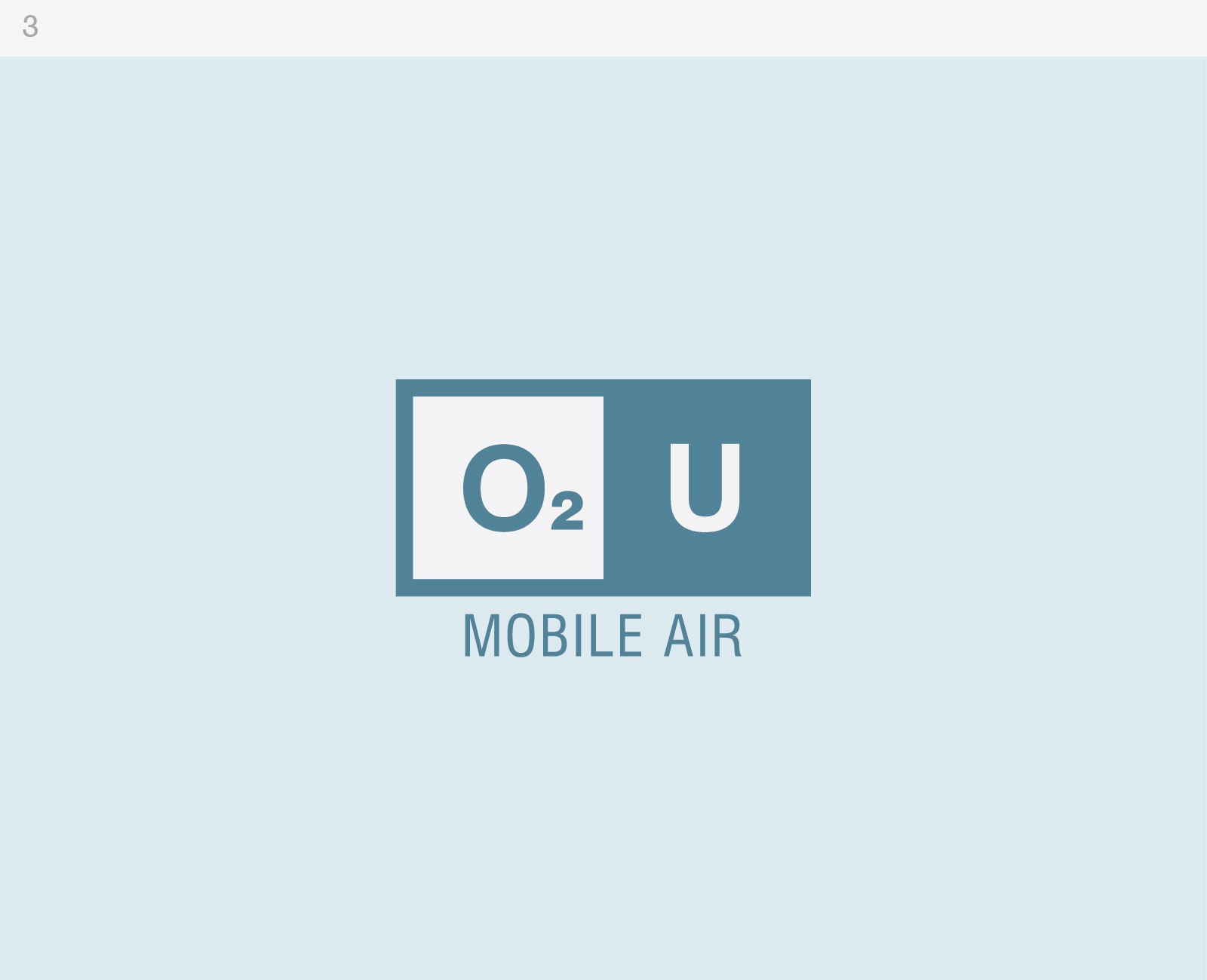
Here are 3 different takes on the logo you chose with the requested changes. You'll notice I shrank the 2 to be more similar to the "periodic table" style we were going for. These are just clean and simple versions with some color choices to show where we can take each design. Once you select one of these (or a variant), then I can polish them up a bit more (i.e. adding texture, perfecting text, etc).
Let me know your thoughts!
- Randy


