Hey Dude! I hope your trip was awesome :)
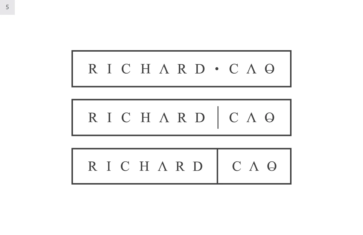
I've got some updated designs for you! I've stuck (as the main design) to the original number 1 design. I really think this speaks you and the style that you want to achieve :) I've given you a couple options on the logo to show how we could switch things up a bit if you'd like. Overall, I think we should separate the the text box from the icon and use them individually (as well as some other elements).
As for your entire brand, I want it to be primarily typography based, with the font being elegant but definitely contemporary as well. Then, we're going to bring in bright accent colors to bold things up a bit. My favorite is the orange if you couldn't tell :) Start imaging your website with these simple 1 (or 2) word items with overlaid blocks of color, but extremely minimal... Sounds good doesn't it?
As always, feel free to let me know your thoughts below. and if you ever want to jump on the phone or anything, let me know!